This concerns neither food nor hamburgers. Sorry. Hit the food category of this blog for that sort of stuff.
Even if you’re not familiar with the term “hamburger menu” you’ve seen one. Three horizontal lines, like in the image below, but much smaller, on a mobile webpage, usually up in a corner.
Hamburger menu on the left, not the burger restaurant menu on the right.
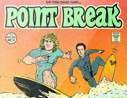
Why is Keanu in two movies I can use to explain what a breakpoint isn’t?
More quick, quirky, visual vocabulary for the lay-reader: A breakpoint has nothing to do with surfing and robbing banks. Nor does it have much to do with a thing stressed to the point that it loses integrity.
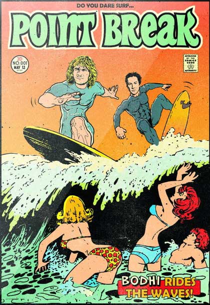

You can buy a print of the limited edition Point Break art by clicking this.
In the web development world, a breakpoint is a definable CSS variable telling the browser rendering engine when to switch to a different page layout. The funny-bone of responsive design, breakpoints are how you can sometimes go to a page on four different devices (phone, tablet, notebook, desktop) and see four different versions of the same content. Got it?
Now that we’re all on the same page, (pun?) here’s the buried lead. Or maybe it’s the meat? The TL;DR? Not sure what the lingo is these days.
- Don’t switch to a hamburger menu for common desktop and laptop resolutions, unless it’s intentional. …Assuming you have decent reasons.
- Heed results of past hamburger menu UX tests to make it a more effective tool. Get hamburger-smart.
That’s it. Want more?
Specific Notes Re: Hamburger Menu Breakpoints and Other Mobile Menu UX Apocrypha
Hamburger Menu Breakpoints
Though appropriate for some small-screen content presentations, a hamburger menu obfuscates otherwise obvious links to your most important content, invisibly hiding them behind a click, so we want to delay leaning on it as long as possible. Why hide your main site navigation from laptop/desktop viewers? Set breakpoints appropriately.
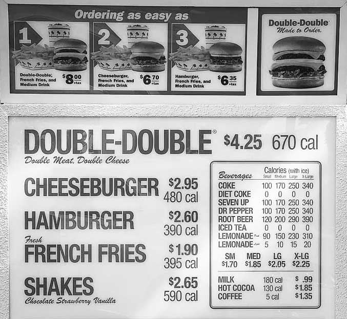
Many of your website visitors use 1920 pixel wide widescreen monitors. Clever Mac users and Windows users both know how to quickly and handily split (mac) or snap (win) apps to use half of that screen real estate. Forcing non-mobile visitors to interact with a made-for-mobile hamburger menu at common desktop browser sizes is frustratingly lazy at best. The #1 maxim of UX: Don’t frustrate people.
Make the hamburger a helper, not a hindrance.
What’s a good breakpoint to start showing the hamburger menu? If you decide a hamburger menu’s right for your site, at about 934 pixels on 1080p screens, or at about 1154 on 1440p, and the corresponding half-point on 4k, you should usually switch to the burger, rarely if ever at wider resolutions. (Which puts me at odds with the tired, old conventional wisdom.)
Subtle but important caveat: in an ideal situation, with a properly funded web effort focused on smart user interaction, the content will often dictate breakpoints. More on content-defined breakpoints here, and a deeper dive on breakpoint-by-content from Google. (Neither of them touch much on the notion of tight taxonomies for navigation, which I’ll save for another menu UX blog post.)
Hamburger Menu UX-Smart Design Elements
UX tests show there’s value in using the text “menu” instead of, or in addition to the three-line hamburger menu icon. Up your goal-conversion value even more by giving the menu icon an outline. Doing these things might get more people interacting with your mobile menu.
This article doesn’t delve into the nuance of viewports, media queries, problematic user agent sniffing and many other elements of the fine-arty science of giving website visitors a good user experience with dynamic, responsive page layout, but it’ll do. You’ll find conjecture on some of these topics. …Mostly people leaning on one aspect of nuance while ignoring others. Like me.
What’s your #2 UX axiom?
Test. Always be testing. Just because I cite evidence from old a/b/x tests, that doesn’t mean it’ll work for you. Maybe your audience and use-case are special somehow. Times change. Gather your own data. Your website can be better. Hit me up if you want me to help you setup some multivariate tests on your website. Every test will make you money improve the experience of your visitors.
Dan Dreifort helps organizations rank better in Google for searches that matter. He also helps them convert more website visitors into customers. The SEO-UX one-two knockout punch. (He replaced the hamburger on that SEO site with a top-of-screen tabbed nav-bar.) Dan cofounded Reddaddo. When he’s not doing that, he makes music, battles cats, nudges campaign finance reform along, champions death with dignity, and watches crappy films with his hot triathaloner doctor-wife.
 Dan Dreifort